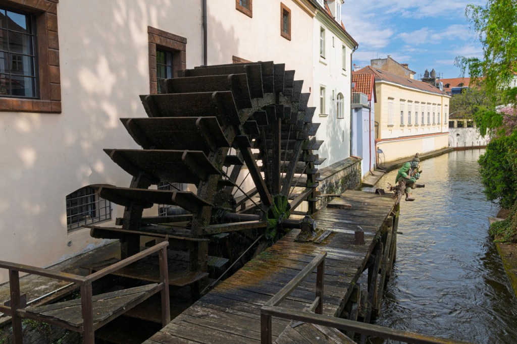
Image straight out of the camera on the left. On the right is my processing. Shadow slider to the right, highlight slider of the left, 20-30 each on Saturation, Vibrance, and Texture in Lightroom or Adobe Camera Raw.
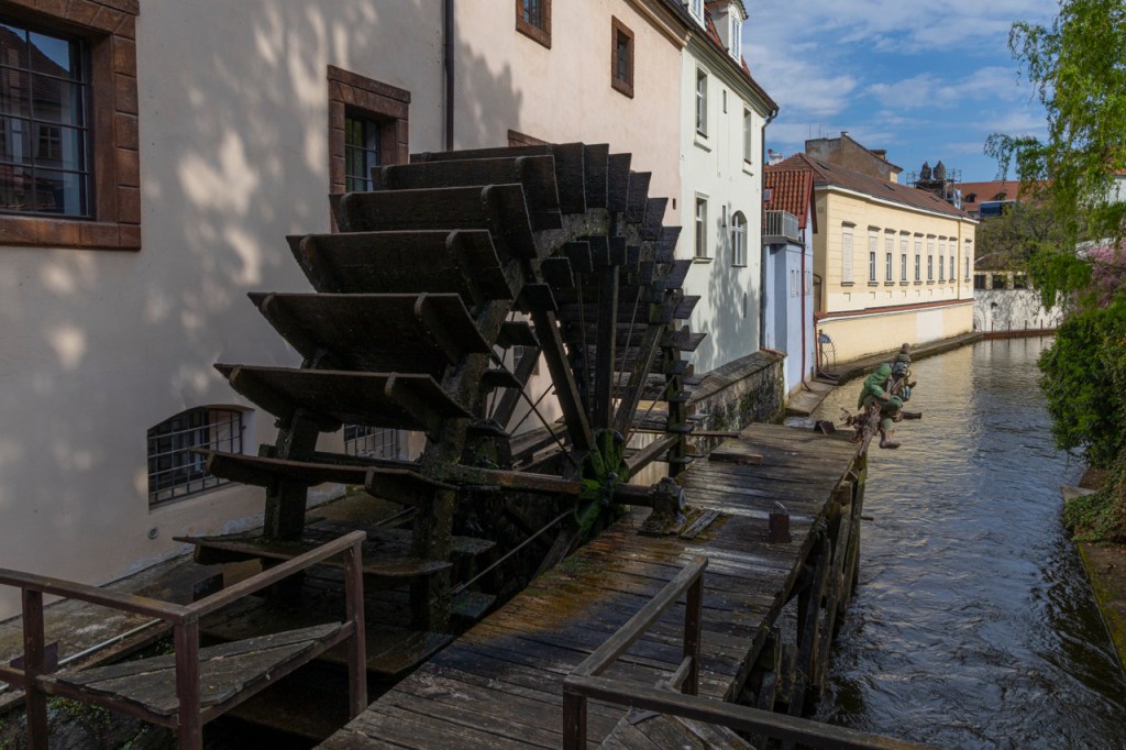
Auto processing on the left. Adaptive Color on the right. Both buttons found in Lightroom or Adobe Camera Raw.
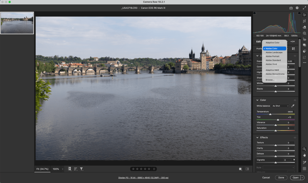
Just in case you’re not familiar with Auto or Adaptive Color, here’s a screen capture. These are “presets” that process your images for you. Or, maybe give you a starting point.
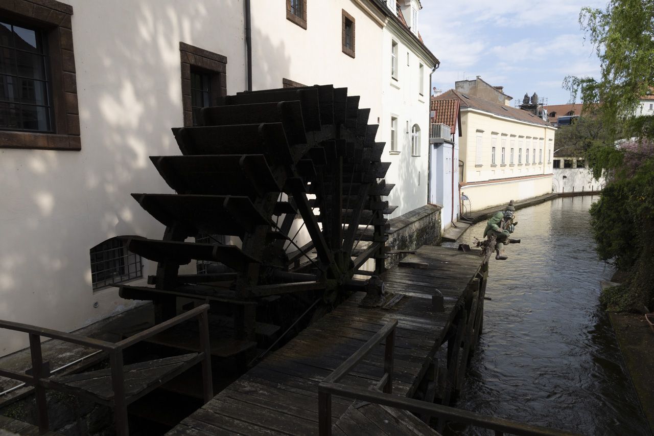
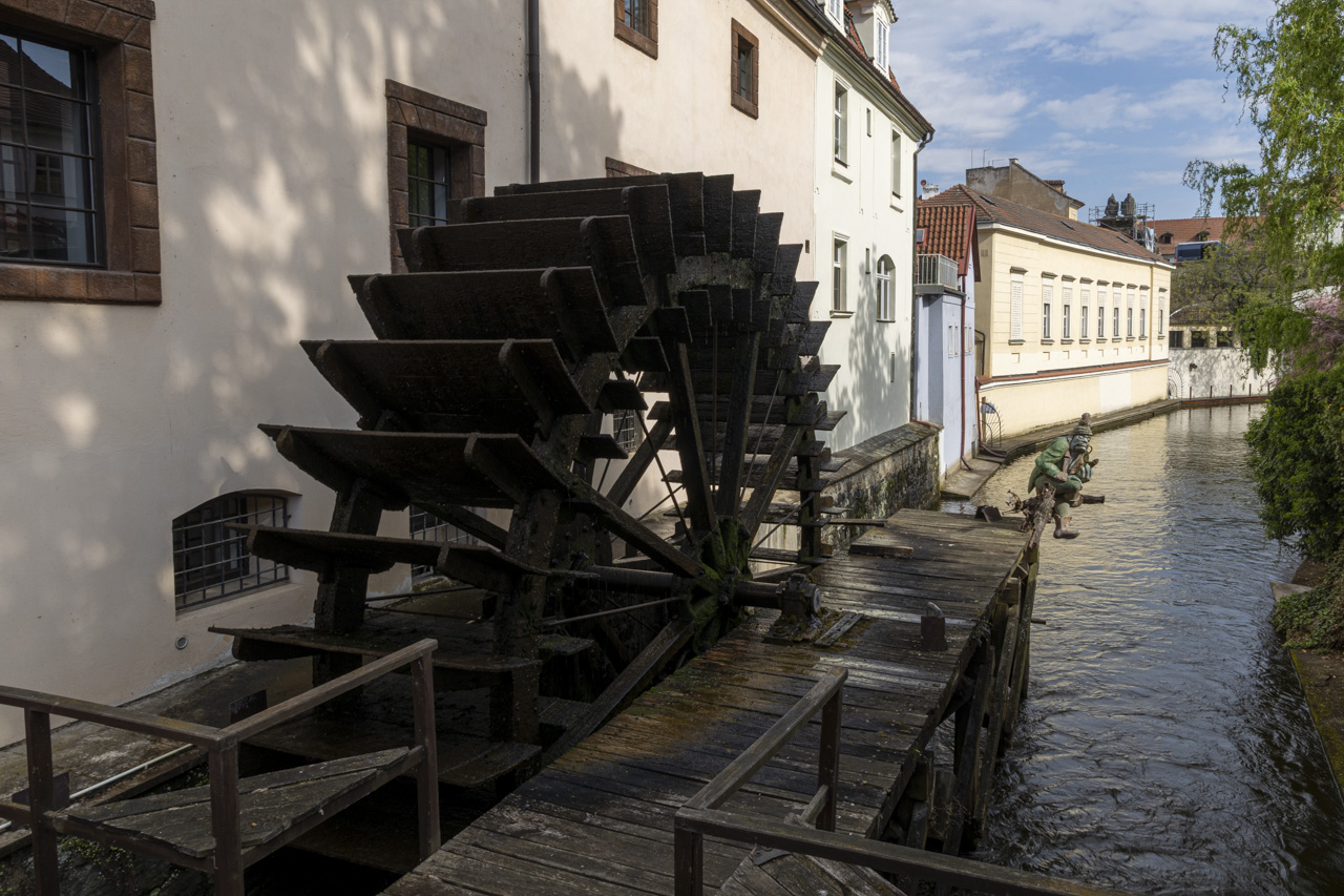
Do you see a preference? The differences are subtle. Let me know your thoughts.
Professional photographer leading workshops and tours. I use Canon cameras but I'm familiar with all the other brands. Love photography birds and nature. Love talking about photography and gear.
View all posts by kathyadamsclark
4 thoughts on “Processing: Adaptive Color vs Auto vs Me”
Your processing is obviously the best of the ones you showed. What do you use for the starting profile, the default Adobe Color? I most often use Adaptive Color with modifications such as you made, but I don’t think “shadows to the right, highlights to the left” is a good move, however. It results in a flat look that can be only partially corrected by the other sliders.
Thanks, Dick. My stating profile is usually Adobe Color. From there I set exposure and black based on the historgram. Then 20-30 for Vibrance, Saturation, and Texture. Then shadows and highlights if needed. I agree with you that the image can be flat is you’re not careful. Sometimes, I click the Adaptive Color just to see what it will do. I don’t like that we can’t see the movement in the sliders. We don’t know what was done with Adaptive Color. Interesting tool, though.


Your processing is obviously the best of the ones you showed. What do you use for the starting profile, the default Adobe Color? I most often use Adaptive Color with modifications such as you made, but I don’t think “shadows to the right, highlights to the left” is a good move, however. It results in a flat look that can be only partially corrected by the other sliders.
LikeLike
Thanks, Dick. My stating profile is usually Adobe Color. From there I set exposure and black based on the historgram. Then 20-30 for Vibrance, Saturation, and Texture. Then shadows and highlights if needed. I agree with you that the image can be flat is you’re not careful. Sometimes, I click the Adaptive Color just to see what it will do. I don’t like that we can’t see the movement in the sliders. We don’t know what was done with Adaptive Color. Interesting tool, though.
LikeLike
Yours. Subtlety.
LikeLike
That’s Barbara. The difference is subtle between them all.
LikeLike